Thursday, August 15, 2013

Friday, November 30, 2012
Happy to See...
Thursday, February 16, 2012
Check out...
My first contribution to Blast Magazine, here. The Photography of Jerry Uelsmann at the Peabody Essex Museum
Wednesday, January 11, 2012
Check out...
 Had the pleasure of seeing SpeakEasy Stage Company's Boston premiere of John Logan's Red last Friday night. Such an amazing experience to see an artist's process explained and explored onstage, instead of in an art history book. Not to be missed.
January 6 – February 4, 2012By John Logan
Directed by David R. GammonsStarring Thomas Derrah and Karl Baker Olson
Winner of six 2010 Tony Awards including Best Play, Red is a searing portrait of an artist’s ambition and vulnerability. After he lands the biggest commission in the history of modern art, abstract expressionist painter Mark Rothko begins work on a series of large murals with the help of a new young assistant. What takes place between the two men is a master class on the methods and purpose of art and the dynamic relationship between an artist and his creations.
Editorial Disclaimer: The author of this post received discounted or complementary admission to the above mentioned performance, courtesy of the host institution, organization or gallery.
Thursday, December 8, 2011
Wonderfill: The Art of Nathan Lewis

Last Thursday, I attended the opening reception of Wonderfill: The Art of Nathan Lewis, at one of my favorite South End boutiques, J.E.M. I love his work. He makes me laugh.
Wonderfill is on view at J.E.M. until January 31st.
Watch Nathan describe his process here.

Nathan and I. Image courtesy of Randy Gross and J.E.M.
Monday, December 5, 2011
What’s Love Got To Do, GOT TO DO, With It?!
 Man Ray (1890–1976); A l’heure de l’observatoire – les amoureux (Observatory Time – The Lovers), 1964, after a canvas of c.1931; Color photograph; 19 5/8 x 48 3/4 in. (50 x 124 cm); The Israel Museum, Jerusalem; © 2011 Man Ray Trust/Artists Rights Society (ARS), New York/ADAGP, Paris/ Photo © The Israel Museum by Avshalom Avital.
After a very unpleasant episode where a matter of the heart caused acute emotional downfall, Man Ray/Lee Miller, Partners in Surrealism which was on view at the Peabody Essex Museum (PEM) might not have been the best way for me to spend an afternoon. What I basically took away from the exhibition was that love and respect can lead to wonderful creative things. No shit.
Although the romantic relationship between Ray and Miller was short lived, its existence and demise was the catalyst for each artist to produce some of the finest works of their respective careers and led to a deep, lifelong friendship.
Exceptionally organized and well researched, the exhibition was laid out chronologically, introducing us to each artist prior to their meeting (Miller convinced the very reluctant Ray to let her apprentice under him), works that each created in Paris during the course of the romance, then those made after its volatile end. The show was rounded out with pieces created by Pablo Picasso, Roland Penrose (who Miller later married), and others from Ray/Miller’s circle of friends. The first exhibition ever organized featuring Ray and Miller together on equal terms, it was one of the finest and most inspirational I’ve seen this year.

 Lee Miller (1907–1977); Portrait of Man Ray, 1931; Gelatin silver print; 9 1/8 x 6 7/8 in. (23.3 x 17.5 cm); Lee Miller Archives, Sussex, England; © Lee Miller Archives, England 2011. All rights reserved. www.leemiller.co.uk
Man Ray (1890–1976); Solarized Portrait of Lee Miller, c. 1930; Gelatin silver print; 9 1/2 x 7 3/8 in. (24.3 x 18.8 cm); The Penrose Collection, Sussex, England; © 2011 Man Ray Trust/Artists Rights Society (ARS), New York/ADAGP, Paris/Courtesy of The Penrose Collection. All rights reserved.
"This exhibition is a microcosm of Surrealism, embodied by two people and their feelings for each other. Together, Man Ray and Lee Miller became the ultimate Surrealist object - two people who were inescapably drawn to each other, but could not make it work." - Phillip Prodger, PEM Curator of Photography.

Man Ray (1890–1976); Indestructible Object, originally made 1928, destroyed Paris 1957, this replica 1959; Metronome with gelatin silver print of Lee Miller’s eye; 9 1/8 x 4 1/4 x 4 1/4 in. (23 x 11 x 11 cm); The Penrose Collection, Sussex, England; © 2011 Man Ray Trust/Artists Rights Society (ARS), New York/ADAGP, Paris/Courtesy of The Penrose Collection. All rights reserved.
Ray made the first version of this object shortly after Miller left him. Attaching a photograph of Miller’s eye to the metronome, he linked his memory of her to the idea of an insistent beat or pulse that was both irksome and unending – a metaphor, perhaps, for human desire. The original, destroyed in Paris in the late 1950's, was titled Object to be Destroyed. This later version, Indestructible Object, was produced in an edition of 100.
Learn more about PEM and upcoming exhibitions here.
Editorial Disclaimer: The author of this post received discounted or complementary admission to the above mentioned exhibition, courtesy of the host institution, organization or gallery.
Friday, October 21, 2011

Thursday, October 13, 2011
I Now Need A Big Yard So I Can Buy This
I was in Manhattan this past weekend; saw Richard Serra’s two new sculptures, Junction (2011) and Cycle (2010), at Gagosian West 24th. The enormous tilting and winding sheets of oxidized steel made me feel like I was in a tunnel on mars. Or tripping.

RICHARD SERRA, Cycle, 2011, Weatherproof steel, 62' x 56' x 14'
Copyright Richard Serra. Courtesy Gagosian Gallery. Photo by Lorenz Kienzle
I consider space to be a material. The articulation of space has come to take precedence over other concerns. I attempt to use sculptural form to make space distinct.
– Richard Serra
Yay art! Image courtesy of my soul sister, Laura Semon

Monday, October 3, 2011
A Lot Like Yesterday, A Lot Like Never
Billed as a masterpiece by some (not so much by others) I spent a good portion of last Saturday at the Museum of Fine Arts, Boston, watching Video and Sound Artist Christian Marclay’s The Clock. With the help of six assistants and almost three years, Marclay was able to create a twenty-four montage of thousands of film and video clips depicting or referencing the precise time of day.
Originally debuting at White Cube, Mason’s Yard last fall, The Clock went on to be screened at Paula Cooper in New York and at this year’s Venice Biennale where it was awarded the Golden Lion. “The Clock has an appeal, as everyone is concerned about time. We never have enough time to do anything,” Marclay told a news crew after his big win in Venice.
The MFA’s debut of The Clock (it co-purchased one of the six copies in existence with the National Gallery of Canada) coincides with the opening of the museum’s new Linde Family Wing for Contemporary Art, a $12.5 million refurbishment of the museum’s 1981 west wing, designed originally by noted architect I.M. Pei.
Christian Marclay’s The Clock will be on view at the MFA until October 10. For more information go here.
Wednesday, July 27, 2011
The Super Gross Medium Was the Message
I decided to lie down and relax. Although the benches lacked any identifying placards, artist statement or invitation to do so, I needed a break and was happy to learn that they were pretty comfortable for concrete slabs made to look like Flex-A-Beds. Surrounded by a sea of green grass, a cloudless sky and the California sun, my jet lag began to melt as I rested on Teresa Margolles’ latest installation.
But there at the Los Angeles County Museum of Art (LACMA), in the shadow of the mausoleum that Eli Broad built for himself, I couldn’t help but fixate on the materials used to create my temporary bed; a mixture of cement and “liquid that was used to clean corpses in an autopsy room in Mexico – four gruesome fatalities, all products of drug – and gang-related violence.”
The commission, a collaboration between LACMA and the Los Angeles Nomadic Division (LAND), encourages its audience “to feel the overwhelming energy of aggression that produced the infused material,” while existing as both monuments to the dead and a place for the living to rest.
Never before had Marshall McLuhan’s over referenced theory rang so true for me. Although at times I’ve found an artist’s use of certain medium amusing (Hirst with flies, Warhol with his piss), the connection between Margolles, her medium and the lives that those benches represented was overwhelming. How did Margolles come into possession of the liquid? How many lives have been lost to drug related violence in Mexico? Do the victim’s families know that these benches exist; that they are bringing joy and awareness to people a short trip, but a world away, from their hometown? It was a lot to think about before a nap.
Teresa Margolles’ benches will be on display on the Resnick North Lawn at LACMA until August 28, 2011. For more information go here.
Editorial Disclaimer: The author of this post received discounted or complementary admission to the above mentioned exhibition, courtesy of the host institution, organization or gallery.

But there at the Los Angeles County Museum of Art (LACMA), in the shadow of the mausoleum that Eli Broad built for himself, I couldn’t help but fixate on the materials used to create my temporary bed; a mixture of cement and “liquid that was used to clean corpses in an autopsy room in Mexico – four gruesome fatalities, all products of drug – and gang-related violence.”
The commission, a collaboration between LACMA and the Los Angeles Nomadic Division (LAND), encourages its audience “to feel the overwhelming energy of aggression that produced the infused material,” while existing as both monuments to the dead and a place for the living to rest.
Never before had Marshall McLuhan’s over referenced theory rang so true for me. Although at times I’ve found an artist’s use of certain medium amusing (Hirst with flies, Warhol with his piss), the connection between Margolles, her medium and the lives that those benches represented was overwhelming. How did Margolles come into possession of the liquid? How many lives have been lost to drug related violence in Mexico? Do the victim’s families know that these benches exist; that they are bringing joy and awareness to people a short trip, but a world away, from their hometown? It was a lot to think about before a nap.
Teresa Margolles’ benches will be on display on the Resnick North Lawn at LACMA until August 28, 2011. For more information go here.
Editorial Disclaimer: The author of this post received discounted or complementary admission to the above mentioned exhibition, courtesy of the host institution, organization or gallery.
Sunday, June 5, 2011
A Useful Way to Use All These Bottle Tops. FINALLY!
In 2002, while out on a walk, artist El Anatsui found what would become his most recognizable artistic medium…thousands of metal liquor bottle tops. “When I first found the bag of bottle tops, I thought of the objects as links between Africa and Europe,” Anatsui has said. “For me, the bottle caps have a strong reference to the history of Africa.” Over the past decade, Anatsui, a Ghanian who has taught and worked in Nigeria since the late 70’s, has created an extensive body or work which utilizes these tops. Recognized as one of the most influential and notable contemporary African artists, these installations anchor Anatsui’s first career retrospective now on view at the Davis Museum at Wellesley College.
Organized by the Museum of African Art, New York, When I Last Wrote to You about Africa, showcases Anatsui’s ability to create pieces from a variety of surprising materials that are both beautiful and serve as critiques on modern social and political life in Africa. His bottle top sculptures exist as tapestries, huge shiny, booze stained tapestries. “The liquor bottle tops and labels have something in common with the Ghanain practice of naming textiles. The names given to textiles and drinks reveal a lot about the culture and, at times, the history of a place. The bottle tops were introduced by European traders, and alcohol was one of the commodities they brought with them to exchange for African goods.”

Sacred Moon, 2007, aluminum and copper wire, 103 x 141 inches. Image courtesy of Jack Shainman Gallery.
When I Last Wrote to You about Africa will be on view at the Davis Museum until June 26. For more information, go here. To see more of Anatsui's work, go here.
Wednesday, April 6, 2011
Steaming Piles of Polyurethane: This is Why I Love Lynda
Often overlooked, always avant-garde, artist Lynda Benglis began her career in New York as a painter at the height of the minimalist movement. In 1968, she began creating her “Fallen Paintings” by pouring latex directly onto the floor. Now, 40 years later, just steps from the studio at 222 Bowery she has occupied since the 70’s, the most iconic piece from this creative period, Contraband, is on display in the lobby of the New Museum.


Image courtesy of the New Museum
The sculptural work for which Benglis is most well known, and the anchor of this retrospective, is minimalist in medium (polyurethane, wax, aluminum etc.) but executed in an abstract expressionist style. It’s easy to see Jackson Pollack’s influence in her pieces; the pigmented latex being applied to the floor the same way Pollack dripped house paint on canvas to create his iconic action paintings 20 years prior.
These pieces were also Benglis’s first attempts to disrupt the male dominated minimalist movement. Experimentation with photography and film and heightened feelings of underrepresentation led Benglis to take out an advertisement(NSFW!) in Artforum in 1974, where she posed nude with an extra large, lifelike latex dildo between her legs. Although the advertisement is now viewed as an important statement on gender in contemporary art, it brought Benglis much criticism from the feminist community (her creative insecurities led to this over-the-top gesture). A number of Benglis’s pieces that challenge sexuality and gender are the highlights of this show.
However significant her work has been to contemporary art on a conceptual level, Benglis’s pieces are most importantly exciting, comical and fun to engage with. Benglis created Phantom in 1971 by making amateurs of chicken wire covered in plastic and then by pouring phosphorescent polyurethane over them. The glow-in-the-dark figures appear to be emerging from the wall, the finger tips of a monster slowly transitioning into this dimension. Authors note – DO NOT SMOKE WEED IMMEDIATELY BEFORE SEEING THIS SHOW!
Image courtesy of the New Museum
Lynda Benglis was organized by the Irish Museum of Modern Art, Dublin, in collaboration with Van Abbemuseum, Eindhoven; Le Consortium, Dijon; The Museum of Art, Rhode Island School of Design, Providence; and the New Museum, New York. The exhibition is on view at the New Museum until June 19. For more information go here.
Editorial Disclaimer: The author of this post received discounted or complementary admission to the above mentioned exhibition, courtesy of the host institution, organization or gallery.
Thursday, March 31, 2011
Out and About: Boston University Art Gallery
I got a chance to see Three Artists at The Caversham Press – Deborah Bell, Robert Hodgins and William Kentridge, at the BU Art Gallery before it came down.
Well curated and installed, it was refreshing to learn about three artists and an artistic center that I was ignorant to.
Adapted from the offical press release:
This exhibition features the work of three South African artists who were important participants in the early years of The Caversham Press. Comprising over 65 prints, the exhibition features selections from three collaborative print portfolios—Hogarth in Johannesburg, Little Morals, and Ubu Tells the Truth—as well as individual prints created by Bell, Hodgins and Kentridge at Caversham from 1985 to the present. Collectively, the work reflects Caversham’s beginnings as well as articulates the artists’ perspectives of living and working in South Africa during the years between late apartheid and the transition to the new democracy.
Sunday, February 27, 2011
A Bunch of Shit Was Harmed in the Making of Destrukto
McDonald’s hamburgers, computer monitors and cans of Budweiser all met their fate at the hands of artist Bill Burke in the making of Destrukto, a series of photographs that document inanimate objects being shot. With a gun. And a camera.

Image courtesy of Howard Yezerski Gallery
They’re a far cry from the documentary photos Burke is most well known for; the horrific results of war and poverty in Southeast Asia, Appalachian coal mining towns and the people that call them home, and are the artist’s furthest journey into the space where photography and performance art meet.
Destrukto is on view at Howard Yezerski Gallery, Boston until Tuesday, March 15.
Go here for gallery hours, location, etc.
Sunday, January 23, 2011
Out and About: A Week in Review
Lawrence Weiner
Gyroscopically Speaking
Marian Goodman Gallery 
A founder of the conceptual art movement, Lawrence Weiner uses text to challenge traditional assumptions viewers may have about an object. Phrases such as “Pushed Forward/ Close By/ Pushed Aside/ Close By/ With Graceful Haste” line an S-shaped wall constructed in the north gallery of Marian Goodman as part of the artist's most recent gallery show, Gyroscopically Speaking.
The bold, curving lines that accompany most of Weiner’s pieces in the show are a tool to manipulate the viewer’s eye, the most basic goal of any visual art work. These lines also allow the viewer to maintain a sense of orientation (hence, the gyroscope) while interpreting the text. However, the phrases Weiner presents remain open to individual interpretation, and that fundamental relationship between what is being presented and how it is being interpreted is the most significant aspect of Weiner’s work.
Lawrence Weiner, TAKEN FROM THE WIND & BOLTED TO THE GROUND, 2009, LANGUAGE + MATERIALS REFERRED TO. Courtesy of the artist and Marian Goodman Gallery, New York and Paris
Mark Bradford
The Institute of Contemporary Art, Boston 
Contemporary art superstar Mark Bradford is the subject of the ICA’s latest blockbuster exhibition, Mark Bradford. It's also the first survey exhibition of the Los Angeles based artist’s work which consistently explores race, class and gender in American urban society. Organized by the Wexner Center for the Arts, Ohio State University, Mark Bradford includes installation, video, sculpture and the collage paintings the artist is most famous for.
Mark Bradford, "Strawberry," 2002. Image Courtesy of the ICA, Boston and the Collection of Barbara and Bruce Berger
Thursday, December 23, 2010
When I Have Time Off, I Look at Art and Drink.
I recently shook myself free from the shackles of corporate America and enjoyed a week off between my emancipation and the start of an amazing new position. I made some calls, bought some tickets and had an incredible time. Here’s a brief snapshot of what I saw, drank and thought in New York and Dallas.
New York
What I Saw:
John Baldessari: Pure Beauty
Oct. 20, 2010 – Jan. 9, 2011
Metropolitan Museum of Art
The most extensive retrospective to date of Los Angeles-based artist John Baldessari, Pure Beauty is an exceptionally organized show, offering highlights from every decade of the conceptualist artist’s career. His early use of text, photography and film and the underlying theme of “What makes art, art?” has influenced countless contemporary artists, apparent in the works of Cindy Sherman and Jenny Holzer.
Standout Piece:
In 1970, frustrated with the limitations of his previous work, John Baldessari burned pieces he created between 1953 and 1966. “Cremation Project,” as it became to be known, was not only a disavowal of his previous life as a painter and what came of his efforts, but a definitive moment in Baldessari’s transition towards a more hands-off approach in creating art.
New York
What I Saw:
John Baldessari: Pure Beauty
Oct. 20, 2010 – Jan. 9, 2011
Metropolitan Museum of Art
The most extensive retrospective to date of Los Angeles-based artist John Baldessari, Pure Beauty is an exceptionally organized show, offering highlights from every decade of the conceptualist artist’s career. His early use of text, photography and film and the underlying theme of “What makes art, art?” has influenced countless contemporary artists, apparent in the works of Cindy Sherman and Jenny Holzer.
Standout Piece:
In 1970, frustrated with the limitations of his previous work, John Baldessari burned pieces he created between 1953 and 1966. “Cremation Project,” as it became to be known, was not only a disavowal of his previous life as a painter and what came of his efforts, but a definitive moment in Baldessari’s transition towards a more hands-off approach in creating art.
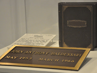 Image courtesy of DNAinfo/Jennifer Glickel
Pure Beauty was organized by LACMA in association with Tate Modern. It is on view at the MET until Jan. 9, 2011. For more information go here.
What I Drank:
Vodka. And a lot of it. I spent Friday night at a big gay toys for tots benefit and it was open bar. Enough said.

What I Thought:
“Cremation Project” is a lasting testament to the transition in Baldessari’s career and creative process. Maybe the piece resonated so much because I’m in the process of my own career transition. And who hasn’t wanted to burn it all to the ground before.
Dallas
What I Saw:
The Dallas Museum of Art
My first time to the DMA, I was extremely impressed with the facilities, the diversity of the permanent collection and the breadth of community programming.
For visitor information, go here.
Standout Pieces from Re-Seeing the Contemporary (Oct. 15, 2010 - March 20, 2010):
David Szafranski's “Is it Fear or Desire” and Alan Saret's "Deep Forest Green Dispersion"

Deep Forest Green Dispersion, 1969, Alan Saret, American Galvanized hex netting, painted,Dallas Museum of Art, gift of John Weber
What I Drank:
What didn’t I drink?! Delicious margaritas at an excellent authentic Mexican restaurant, bottle after bottle of assorted red wines (bought in a slightly dream like shopping spree at Costco) and Miller Light. From a bottle and from a keg.
What I Thought:
Texas gets a bad rap.
Monday, December 6, 2010
Monday, November 29, 2010
The House that Malcolm Built
This past Friday, I braved the cold and the after Thanksgiving crowd to sneak a peek of the highly anticipated Art of the Americas Wing at the Museum of Fine Arts, Boston. After walking into the Shapiro Family Courtyard, the massive cube that connects the new wing to the original building, it would be hard for anyone to argue that this extensive and costly project is anything but a success for the MFA and the entire Boston arts community.

Ruth and Carl J. Shapiro Family Courtyard © Chuck Choi. Image courtesy of the Museum of Fine Arts, Boston
About ten years ago, well known (infamous, to some) MFA Director Malcolm Rogers began to build support for the expansion, eventually raising $504 million for the new wing. Criticized in the past for his staff overhauls and controversial exhibits, you can feel Roger’s fingerprint throughout the new wing, which will undoubtedly serve as a lasting reminder of his tenure at the MFA.
Designed by London based architectural firm Foster + Partners, the 133, 491 square foot addition houses more than 5,000 pieces from North, South and Central America in 53 galleries. As you ascend the four floors, you are also moving forward in time. The lower ground level consists of a relatively small collection of Pre-Colombian, Andean and Native North American art along with pieces from 17th century New England. Level one and two takes visitors through American Colonialism, American Impressionism and beyond. These two levels showcase what the MFA is most well known for; it’s expansive collection of 18th and 19th century American art and artifacts. Iconic works by John Singer Sargent, John Singelton Copley, Thomas Sully, Samuel McIntire, Winslow Homer and Louise Comfort Tiffany are all on view, and not to be missed by any visitor to Boston.

The Passage of the Delaware, Thomas Sully. Museum of Fine Arts, Boston. Gift of the Owners of the old Boston Museum. Photograph © Museum of Fine Arts, Boston
In sharp contrast to the breadth of work exhibited on floors two and three, the fourth floor consists of a poor collection of modern American art. Although it houses several pieces by Goergia O’Keefe and Arthur Dove, the MFA’s holdings in this category are rather dismal. In a review of the wing, Boston Globe Art Critic Sebastian Smee described the offerings on the fourth floor as “blowsy and third-rate,” a fair assessment in my eyes.
Despite the disappointment the fourth floor provided, the new wing is highly impressive. It transforms the entire visitor experience at the MFA, highlights collection strengthens and embraces where Mr. Rogers and the rest of the MFA staff need to focus acquisition efforts.
For visitor information go here.
Editorial Disclaimer: The author of this post received discounted or complementary admission to the above mentioned exhibition, courtesy of the host institution, organization or gallery.
Monday, November 22, 2010
"The Whitney Announces Curators for 2012 Biennial"
The 2012 Whitney Biennial will be co-curated by the Whitney’s Elisabeth Sussman and independent curator Jay Sanders. This will be the 76th in the Museum’s series of Annual and Biennial exhibitions inaugurated in 1932, which will go on view in March 2010.
Read all about it here.
Read all about it here.
Tuesday, November 16, 2010
Subscribe to:
Posts (Atom)


